The Amazing Science Of Color
Color is everywhere. It is the core of interior design. It may surprise you to learn that there is actually a science to color. There is a certain way that colors are combined that ensure harmony, balance, and even a few surprises.
Color has Impact
The eye takes in color and the brain determines what color it is. Color is actually “seen” by the brain. Color is reflected light that is comprised of a specific combination of light wavelengths. Each one is a different color. It’s the brain’s job to process that light and give us color.
If you are looking for the custom pillows in los angeles, then it would be considered efficient that color always has an impact on every custom pillowsyou buy.
Red tends to amp a person up, give them energy, and often evoke a strong emotional reaction. Blue on the other hand is very calming and peaceful. This figures into design because the colors and color schemes you choose will have an impact on not just what you see but what you feel.

The Color Wheel
Sir Isaac Newton designed the color wheel in 1666. It is used today by artists, graphic designers, and interior designers to help create harmonious color schemes that meet the needs and style of their clients.
Now, if you are thinking of buying headboards in Los Angeles, then it would be considered as the suitable step to go through the color wheel or simply have a gist on the same for the perfect creation.
The color wheel is arranged a certain way:
- 3 Primary Colors – Single colors
Red
Yellow
Blue - 3 Secondary Colors – Primary colors mixed
Green
Orange
Purple - 6 Tertiary Colors – Primary awp-admin/post.php?post=28623&action=editnd secondary colors mixed
Blue-green
Blue-violet
Red-orange
Red-Violet
Yellow-orangecolors
Yellow-green
On the color wheel, the warm colors (yellows, oranges, reds) are on one side and the cool colors (purples, greens, and blues) are on the other side. Drawing a line down the center of the wheel will divide it so that the warm colors are on one side and the cool colors are on the other.
Warm colors are usually perceived as active, bright, and energetic. Cool colors on the other hand, are usually perceived as serene, peaceful, and calm.

Tone, Tint, Shade, and Hue
Hues are colors and tones, tints, and shades are variations of those colors.
- Tone – Any hue that has grey (black and white) added to it.
- Tint – Any hue that has white added to it.
- Shade – Any hue that had black added to it.
These additions can make colors lighter, darker, or softer, depending on what the designer is going for.
Color Schemes
There are several schemes that designers can use in interior design. Each type of scheme offers a different feel or visual experience.
- Complementary Colors – Are opposites on the color wheel. Colors contrast sharply.
- Analogous Colors – Are situated next to each other on the color wheel. 3 colors in scheme: Dominate, support, accent.
Harmonious and pleasing to the eye. - Triadic Colors – Evenly spaced on the color wheel. Colors are usually bright and bold. Creates visual contrast that draws
the eye.
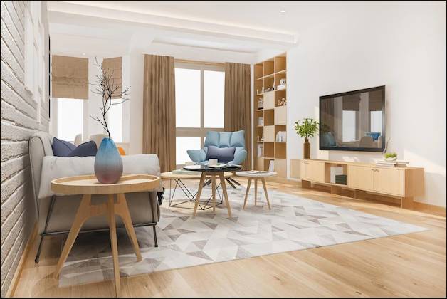
The designers at Valley Drapery & Upholstery can help you create beautiful rooms in the colors you love. Get a cohesive design that reflects your personality. Call today to make an appointment.
Recent Comments